- Published on
Strip Chart: A Powerful Tool for Exploring Data Distribution
What is a Strip Chart?
A Strip Chart, also known as a jittered scatter plot or strip plot, is a type of chart used to display the distribution of data. It is particularly useful for showing the distribution of categorical data by randomly jittering data points along the categorical axis, which helps to reduce overlap and makes it easier to see the spread of the data. A Strip Chart can stand alone or complement other types of plots, such as box plots or violin plots, to provide a more comprehensive view of the underlying data distribution.
Uses of Strip Charts
- Displaying Distribution of Categorical Data: Strip Charts clearly show how data points are distributed within each category.
- Reducing Overlap: By jittering the data points, the chart avoids having many points overlap, making the data more interpretable.
- Multidimensional Analysis: Introducing additional categorical or numerical variables (such as
hue) allows for the display of multidimensional relationships within a Strip Chart.
Implementing Strip Charts in Excel
Implementing a Strip Chart in Excel involves the following steps:
- Prepare Your Data: Ensure your data is organized by categories, with each category's data points listed in a column.
- Select the Data: Highlight the data area you want to display in the Strip Chart.
- Insert a Chart: Go to the "Insert" tab and select "Scatter" from the "Charts" group.
- Adjust the Chart Type: In the Scatter Chart Tools, choose the "Design" tab and then click "Change Colors" to adjust the color of the data points.
- Add Jitter: Excel does not directly support jittering, but you can simulate it by adding an auxiliary column with a small random value for each data point, then using this column as an auxiliary data for the X-axis.
Due to the complexity of implementing a Strip Chart in Excel, the following section will focus on how to create a Strip Chart in Python using the Seaborn library.
Implementing Strip Charts in Python
The Seaborn library in Python provides a convenient function stripplot to create Strip Charts. Here are the basic steps to create a Strip Chart using Seaborn:
Install Seaborn: If you haven't installed Seaborn yet, you can do so via pip:
pip install seabornImport Libraries: Import the necessary libraries in your Python script:
import seaborn as sns
import matplotlib.pyplot as plt
Prepare Data: Use Seaborn's built-in dataset or import your own data:
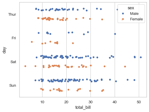
tips = sns.load_dataset("tips")Create Strip Chart: Use the
stripplotfunction to create the chart:sns.stripplot(data=tips, x="total_bill", y="day", hue="sex", dodge=True)Display the Chart: Use matplotlib's
showfunction to display the chart:plt.show()
Example Code
import seaborn as sns
import matplotlib.pyplot as plt

# Load example dataset
tips = sns.load_dataset("tips")

# Create Strip Chart
sns.stripplot(data=tips, x="total_bill", y="day", hue="sex", dodge=True)

# Display the chart
plt.show()
Implementing Strip Charts in R
Creating a Strip Chart in R can be done using the base plotting system or with the help of additional packages like ggplot2, which is part of the tidyverse collection of packages. Here's how you can do it:
Using Base R Graphics
- Prepare Your Data: Make sure your data is in a suitable format, typically a data frame.
- Use the
stripchartFunction: R's base graphics system includes a function calledstripchartwhich can be used to create a strip plot.Here,# Assuming 'data' is your data frame and 'category' and 'value' are the column names stripchart(value ~ category, data = data, method = "jitter", pch = 19, col = "blue")method = "jitter"adds the jitter effect,pch = 19sets the plotting symbol, andcolsets the color.
Using ggplot2
Install and Load ggplot2: If you haven't already, install and load the
ggplot2package.install.packages("ggplot2") library(ggplot2)Prepare Your Data: Ensure your data is in a tidy format, which
ggplot2prefers.Create a Strip Chart: Use
ggplotalong withgeom_jitterto create a strip chart.# Assuming 'df' is your data frame with 'category' and 'value' columns ggplot(df, aes(x = category, y = value)) + geom_jitter(width = 0.2) + labs(x = "Category", y = "Value")The
widthparameter controls the amount of jitter.labsis used to set the axis labels.
Example with ggplot2
Here's a complete example using ggplot2:
# Install and load ggplot2
install.packages("ggplot2")
library(ggplot2)
# Create a sample data frame
set.seed(123) # For reproducibility
df <- data.frame(
category = rep(c("A", "B", "C"), each = 10),
value = rep(c(1, 2, 3), each = 10) + rnorm(30, mean = 0, sd = 0.5)
)
# Create a strip chart
ggplot(df, aes(x = category, y = value)) +
geom_jitter(width = 0.2, color = "blue") +
labs(x = "Category", y = "Value") +
theme_minimal() # For a cleaner look